Top Tips for Choosing the Perfect Gradient
- By Centre Colours
- •
- 17 Dec, 2018
- •
When it comes to brand, logo and website design, one thing is for sure: gradients are making a comeback. While gradients used to be a fun and playful design technique used to draw attention (just cast your mind back to the funky gradient options available in ‘Word-Art’), the flat design era, most popular in 2014, soon saw the back of the gradient technique in logo design.
During the flat design era, gradients were shunned by designers. Instead of mixing colours and creating exciting hues, it was all about flat colours again. Windows, for example, introduced their ‘Metro’ design and Google had their ‘Material’ - both clean and simple designs that used block colours, contrasting against the detailed gradient designs that so many brands used in logos at the time. These simple flat colour designs were ideal for low-resolution mobile devices.
Fast forward a few years, however, and the emergence of high-resolution mobile devices has encouraged the re-appearance of gradients in logo design. Flat colours simply do not have the same aesthetic impact on higher resolution devices as gradients do.
The first big brand to jump on the bandwagon again was Instagram in 2016, with their freshly redesigned logo and app design that used gradients in new ways on a bigger platform than ever before. Spotify soon followed, fusing duotone gradients with emotions in playlists.
Why use gradients in your brand’s logo or website?
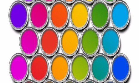
Gradients allow designers to create bold statements by expanding and blending colour schemes to create something that feels both unique and new. Compared to flat colours, gradients can add an individual element to any website or logo; they can be used to channel user emotions and to effectively connect an audience with an idea or product.
Gradients incorporate immersion, realism and three-dimensional elements into designs. A gradient can be used to guide the audience’s gaze and to communicate change. The colours used can determine the whole style of an application or website, which is why they should be chosen carefully. Below we offer a few tips on choosing the perfect gradient. Here are a few other reasons to consider using gradient in your logo or design:
● They can help to create something memorable. Using a good colour combination can make your designs stick out above the rest, helping the audience to remember your message or brand.
● Gradients emphasise your brand colours. If you choose to add a gradient to your brand design, this can be used effectively across all platforms: on the website, on social media platforms and for ad campaigns. Again, these colours will become associated with your brand and stay in the user’s mind.
● Gradients are on trend. Adding gradients to your logo or marketing designs will add a modern touch that is in line with the latest trends in colour and design.
● Gradients are, simply, more playful. People love colours; no one likes a boring design. It’s as simple as that! The most popular logos and designs are bright, eye-catching and modern.
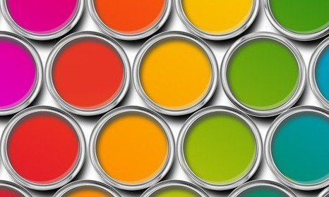
Choose colours carefully
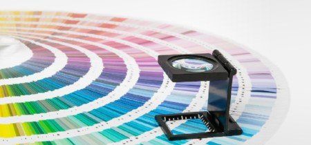
It is important that you do not choose colours randomly. Random colour combinations can look messy and distracting, which is why it is always a good idea to use a colour wheel when looking for inspiration. Whether you’re going for dual-tone or multi-tone, remember that every gradient is only as strong as the base colour. Using the colour wheel, choose colours that are close to each other as they blend more naturally with a smoother transition.
Look to nature for inspiration
You may not even realise, but we encounter gradients every day in nature. Sunsets, the sky, water, mountains, leaves, rainforests… everywhere we look, we are surrounded by beautiful colour combinations. The sky is one of the most beautiful examples of gradient, displaying stunning hues and different shades at every moment. If you are looking for inspiration, watch a sunset and make a note of the different colours and shades that blend into each other. Similarly, clear and bright skies are a great example of the gradient effect too.
Remember that colour mixing doesn’t always look good
While the gradient is both a popular and powerful design technique, it does not work with all logos or designs and it is important to realise this. Sometimes, flat colours do just work better. When used improperly, gradients can be distracting and muddle a layout. When designing a logo, always create a solid version of your logo and then, from there, add gradients. This will clearly show you which design looks better. A gradient should enhance your design; the last thing you want is for gradients to make your logo difficult to read or reproduce.
Some colour combinations don’t work
Referring back to the colour wheel, it is important to understand that some combinations of colour simply do not go together. The transition from red to green is a good example of this. Both colours are bright colour concentrates and specific - in fact, you never see the transition from red to green in nature, but you do see purple-red and orange-purple. Again, the transition from orange to blue does not quite work; raising the distance between them and adding in hues of red and purple inbetween can make the transition far smoother.
Use a gradient generator if you are unsure
Creating a gradient from scratch really can be as simple as choosing a few colours (or even just two), selecting a shape for the gradient and then choosing where colours should overlap. If you do not trust your skills, however, there are plenty of good gradient generators that you can use. It is important that you choose a suitable shape for your gradient: up or down, left to right or radial (where colour variations emerge from a single circular point).
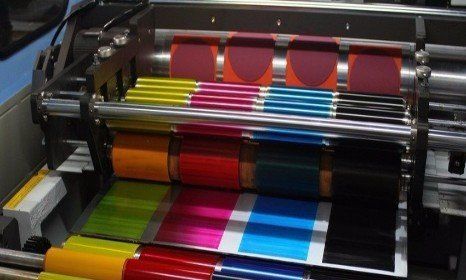
Ensure gradients are suitable for printing
Gradients can look great on a screen; they can add depth and draw the audience’s gaze to certain sections. When transferred onto print, however, they don’t always look as attractive as on a screen. Think about big brands such as McDonald’s and Nike. Both use flat colours in their logo. These logos need to printed out onto packaging (such as burger boxes or shoe boxes) and perhaps would not look as effective if they featured gradients. Printing gradients can result in banding, making designs look somewhat unsightly. Depending on the quality of your printer, you should consider where your designs are going before choosing to add gradient.
Centre Colours
Keeping up to date with the latest colour and design trends is crucial for many brands and businesses. After all, you want to develop and produce product packaging, logos and other marketing tools that are contemporary, relevant and appealing to audiences.
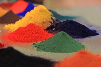
In addition to this, finding the perfect pigment dispersion supplier to make your ink and paint colour dreams a reality is essential.
Here at Centre Colours, an independent dispersion house, we provide high quality colour to these companies to ensure that the colour strength, gloss and transparency are all to the highest standard. We manufacture bespoke products in both small and large quantities. If you are looking for a large scale mixing inks company that promise quality solutions coupled with fast turnaround times, look no further.
For more information about our services, visit our website or contact us today.