10 interesting facts about the colour blue
- By Centre Colours
- •
- 17 Jan, 2019
- •

Blue is one of the primary and undoubtedly most loved colours. It often wins the polls as the most popular choice for favourite colour. Read on for a closer look at this calming and cooling colour and some interesting facts about it:
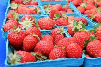
1. How many blue foods can you name? The colour blue is the least common one amongst the foods we eat. Actually, blue is said to suppress your appetite, so perhaps avoid using it when marketing food or cooking.
2. Blue is said to encourage productivity and creative problem solving. This is why many offices use blue as a primary colour in their decor scheme.
3. According to Greek culture, the color blue is said to ward off their ancient superstition of “the evil eye.” To put this in practice, some Greek people choose to wear a blue charm necklace or bracelet for protection.
4. The colour blue is proven to help you stay calmer, and regulate your heartbeat and breathing.
5. Historically, blue was one of the most expensive pigments for painters. This meant that the colour was only used for important subjects. As an example, in the Renaissance age, the Virgin Mary was the most important subject painted and most of the art from that time shows her wearing blue.
6. Wondering where the word blue came from? It is taken from the Old High German word bloat, Old French bleu and Middle English ‘blewe’ or ‘bleu’.
7. Lapis lazuli is the semi-precious stone which resembles the blue shade. Ancient Egyptians used it for ornaments and jewelry. It was also used to create ultramarine, and as an expensive pigment for Renaissance art.
8. Blue eyes are rarer than you think - just 8% of the world’s population have them.
9. In branding and advertising, blue is often used to market those products and services which are associated with hygiene (such as water purification tools and cleaning products), air and sky (airlines and airports), water and sea (sea voyages, mineral water).
10. You’ve probably heard of the phrase ‘seeing red’. While red alludes to strong and passionate emotions, ‘feeling blue has quite the opposite meaning. It represents the calm feelings and lack of strong emotion associated with this colour - such as sadness or depression.
Want to find out more about our pigment dispersions offering? Arrange an appointment to visit us at Units 5 & 6 in the Bypass Park Estate, Sherburn-in-Elmet, Leeds, LS25 6EP. You can book an appointment by giving us a call on 01977 685 458.


